For people with allergies, pollen is an allergen that causes an allergic reaction. Their immune system treats the pollen as an invader and responds by mobilizing to attack, producing large amounts of antibody. This allergic reaction can cause the following symptoms: itchy watery eyes, runny nose, itchy throat, hives, fatigue, and irritability.
“Smart Pollen Monitoring” is a simple and yet powerful 3D-web-based application project designed especially for them. It facilitates a visualization of trees with the analyzed areas of the pollen dispersion in the city area. It illustrates the real-time and past behavior of pollen dispersion at a specific location from each tree directly. It analyzes the area of high pollen dispersion dynamically according to the tree location, tree type and wind information by the period of time.
Additionally, it is possible for users to enter the new tree data which is not yet included in the application database, so users can contribute to update the performance of the application over time.
Overall, it aims to help people with tree pollen allergies to make the right decision about all their activities, for example to select the right place for living or to plan the route to travel which has low level of pollen dispersion.
Gaussian plume models are most commonly used in air-pollution studies, to predict particle concentrations in terms of distance from a ground-level point source. Many researches and studies use this model to apply for pollen grain as well.
This approach deals with light particles with a terminal velocity of zero, and ground level emission. Adding release height and gravitational effects (for “heavy” particles) brought about the next generation of Gaussian plume models, is known as the tilted Gaussian plume (Okubo and Levin, 1989):

where p(x1) is the probability density function of locating a seed or pollen grain at a distance, x1, on the ground with respect to a point source at a given height, xr. Vt is the terminal velocity of the grain, ū is the time and depth averaged horizontal wind velocity, σ is the mean eddy diffusivity (for boundary rather than canopy layer flow) and is described as 2Ax1/ ū, where A is the diffusion coefficient given by k(u*)(x*)/2 . Where u* is the frictional velocity, xr is the release height, and k is the von Kármán constant, regularly used for describing the logarithmic velocity profile of a turbulent fluid flow near a boundary layer. (Gail MacInnis, 2012)
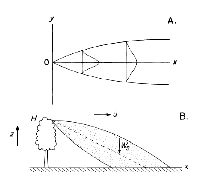
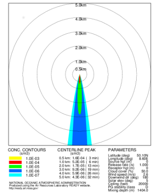
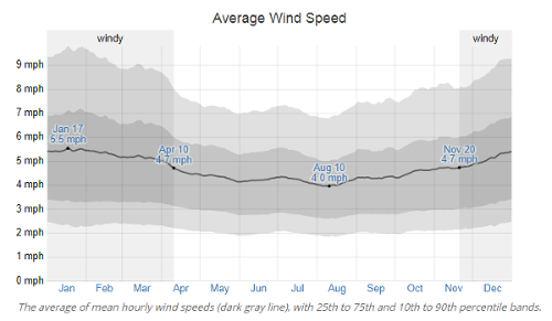
To determine the Gaussian plume models in the study area (Frankfurt), the average wind speed of 4.725 mph of historical wind data was used. It is used to calculate pollen dispersal distance of high density pollen area.
With the Frankfurt wind data, the result of Gaussian plume models is shown in Figure 3. The calculation is made by Air Resources Laboratory (ARL) through the online service which we find out the high-density area tend to be around 500 meters from the source.
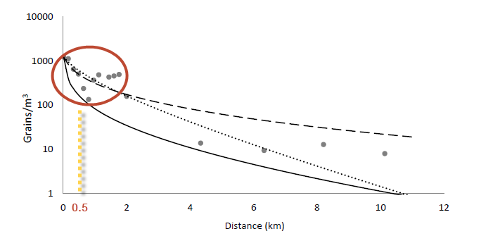
From a related study about pollen dispersal the following information has been excerpted (Gail MacInnis, 2012). He found out that the high-density pollen area is in a distance around 500 meters from the point source.
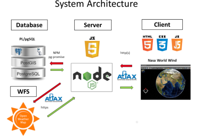
As system setup, a combination of innovative open source technologies is used.
The data fundament is set up through a PostgreSQL database with PostGIS as its spatial extension. This extension enables the database to perform spatial operations and calculations.
For the source of real-time wind data, the API of OpenWeatherMap is used. Through that API at every 5 minutes, the wind data will be updated and used for new analysis and calculation of the pollen distribution zones.
To deliver a fast and multiple user access a node.js server technology is implemented as the heart of the system. It is in use as the application server and brings all components together. The system is controlled through famous node packages like express.js, require.js and pg-promise.
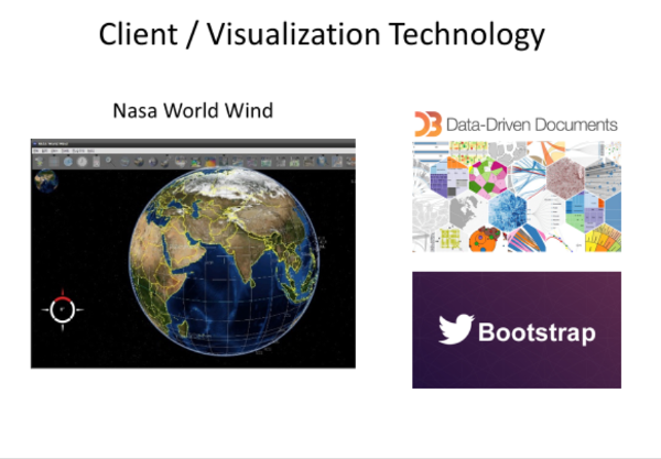
On the client site, the 3-dimensional NASA WORLD WIND globe, builds the fundament for the visualization part of the application. Its functionalities are used to visualize the scientific facts dependent of both, historical and real-time data. In addition, modern JavaScript libraries like d3.js for a charting of data and CSS libraries like twitter bootstrap for the web design are used to promote the client visualization.
As DBMS solution, the open source Postgres technology is implemented. The data organization is distributed into four main branches:
The blooming and tree data build a data set which is always combined with either a historical or real-time wind dataset. That combination defines a final dataset for the visualization of the pollen distribution.
The real-time data are updated in a sequence of 5 minutes and can be used to update the historical data as shown in figure 7.
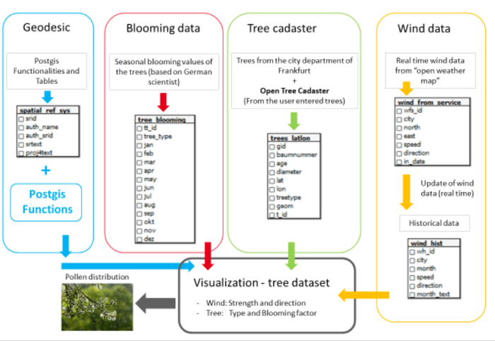
The application server is implemented in the JavaScript based open source server technology node.js. That technology is used, due to its high performance in handling multiple user accesses and the easy handling of its huge package library “npm”, which offers a flexible way to design applications. Processes can be executed asynchronously as well, which is a big advantage if in a brief time data from many sources must be queried and combined.
The main modules and components of the server are:
The express module is used to set up the http(s) communications ways from the server to the client.
Require loads the plain JavaScript files and the asynchronous module API for the node server.
This module is used to connect the node application server with the PostgreSQL database. It promises to suppress the asynchronous processing until the database response for a request.
The requests from the server to the clients are managed with the node module AJAX-request. It enables to make asynchronous server requests.
There are some other smaller modules used for developing and handling data on the server site like body-parser, url-join, pg-format, d3 and nodemon.
The server system is designed through all these node modules, which illustrates the node module combination of the server implementation as in Figure 8.

The client side and the corresponding visualization consist of a combination of three technologies.
The 3-dimensional and open source NASA WORLD WIND globe is the fundament for the spatial visualization. Its JavaScript API delivers a lot of useful functionalities for visualization and calculations in dependence to the NASA globe. Especially the functions for spatial calculations and operations are used to bring the visualization in the coordinate reference system of the globe.
Through the open source charting library D3.js, data driven charts are generated to support the visualization of the NASA globe. That charts make it easy to analyze historical data.
To implement the control elements like buttons and select lists, the open source CSS library bootstrap is used.
Overall, the combination of visualization technologies on the client site is illustrated in Figure 9.
There is an open dataset for trees in Frankfurt. This dataset is used as one of the main datasets, next to a wind dataset. The dataset is provided in CSV – Format. It contains the geographic information of the tree, the type, the year it was planted and the diameter of the crown. The geographic information is given in the ETRS 89 with Easting and Northing. This coordinate system is different from the coordinate system of the NASA globe. Therefore, a conversion must be applied using desktop GIS software.
In total, there are 118377 trees in the datasets covering the city area of Frankfurt as shown in figure 10.
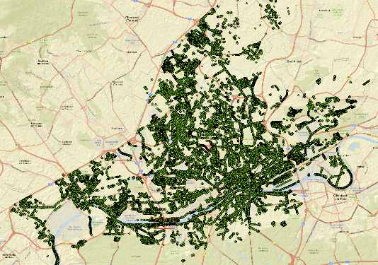
The city of Frankfurt allows a free use of their Datasets. And therefore, the Frankfurt Area was selected as the Main Study area.
There is one problem with the given data as it only includes trees that were planted by the city; there is no data for private trees. This problem is solved by allowing users to add their own tree data. This will be described later.
The Wind data is collected from an online source. The Open Weather Map supplies users with different kinds of data, for this project’s purposes the wind data is needed. The data can be extracted according to the city.
The selected Wind data is constantly inserted into the Database.
request('http://api.openweathermap.org/data/2.5/weather?q=Frankfurt,de&APPID=6639a27f3eaab1bee8fa943c7a51a302', function (error, response, body)
Firstly, the data is requested from the provided api. This Data contains a wide array of different weather based information. The wind data is important; therefore this data has to be selected.
wind_data_current[0] = body.wind.speed;
wind_data_current[1] = body.wind.deg;
wind_data_current[2] = body.name;
The Wind Speed and Angle are inserted into an array together with the city name. This Array then is inserted into the database with a sql command.
db.none('INSERT INTO wind_from_service(speed, direction, city) VALUES($1, $2, $3)', wind_data_current)
As the Website Open Weather Map doesn’t give access to the historic wind data for free this data was not chosen. Instead we collected our own data by looking at the current data and calculating a median from it.
The wind data unit from Open Weather Map is described bellowed.
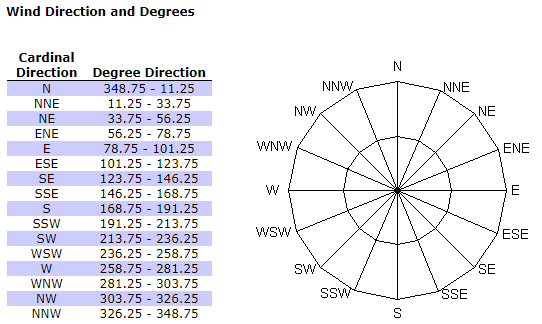
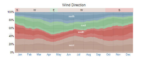
The historical wind data is the typical wind information in Frankfurt am Main, based on a statistical analysis of historical hourly weather reports and model reconstructions from January 1st, 1980 to December 31st, 2016.
The source of the data is from the open source online website (May, 2017) where the important data to calculate pollen dispersal are Average wind speed and wind direction per month.
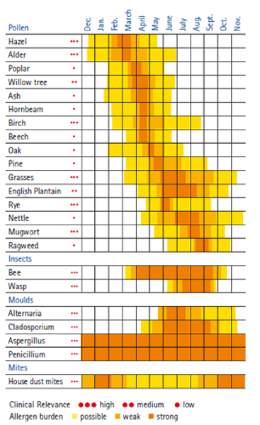
An important base information forthis project is the blooming behavior of trees. Research shows that there is much information about that already available. The existing solutions for visualizing the pollen stress according to the tree type and the month use a model that can be adapted in the application. It is described bellow.
The blooming of trees depends on maturity and temperature. So, according to the mean temperature values of the months, a blooming model with three possibility stages can be set up. That means in months where the temperatures are usually too low, there is no chance that the tree will bloom. In months where the temperatures rarely reach a related value, there is a small chance that the tree is blooming. Around the major blooming season, the chance of blooming is even higher and in the middle of the season the tree will definitely bloom. In terms of possibility this can be expressed as the floating numbers 0, 3.33, 6.66 and 1, where 1 indicates the highest possibility of blooming.
In order to show pollen dispersal on the Nasa World Wind Globe, the dispersal area from each tree has been created using Nasa World-wind javascript (SurfaceEllipse.js). The direction of the ellipses will depend on the wind direction on the period of time users have selected. The size of the ellipses will depend on the seasonal factor (Fs) which is related to tree types and period of time.
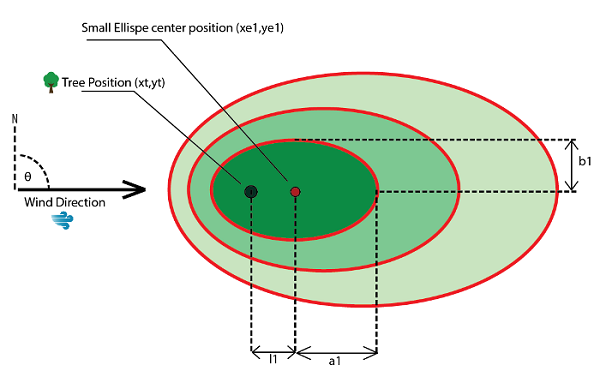
In total, three ellipses will be generated on each tree, showing the higher concentration of pollen in the smaller ellipse (Figure 15). To begin with, the ellipse center position (xe1, ye1), semi-major and semi-minor axis (a1, b1) of ellipse must be computed. So, the distances between tree position and ellipses (l1, l2 and l3) are computed. The high-density area of pollen related the wind direction is around 500 meter distance from the source. Thus, the value of the major axis of the biggest ellipse is set to 500 (Table 1).
| Ellipse size | Compute distance l | Semi-major axis “a” | Semi-minor axis “b” |
|---|---|---|---|
| Small ellipse | l1 = (100)∙(Fs) | a1 = (200)∙(Fs) | b1 = (100)∙(Fs) |
| Medium ellipse | l2 = (150)∙(Fs) | a2 = (300)∙(Fs) | b2 = (150)∙(Fs) |
| Big ellipse | l3 = (250)∙(Fs) | a3 = (500)∙(Fs) | b3 = (250)∙(Fs) |
Then, after getting the distance l, the position of the new ellipse can be computed. As the location related to the globe is preferred to be “Latitude” and “Longitude”, the new position can be computed with the following formula.
Ye (Ellipse latitude) = asin * (sin yt * cos Ad + cos la1 * sin Ad * cos θ)
Xe (Ellipse longitude) = xt + atan2(sin θ * sin Ad * cos la1, cos Ad – sin yt * sin Ye)
Ad (Angular distance) = l / R
Where:
The different color set of the ellipse is used in order to distinguish the ellipses among different types of tree: “High risk, Low risk, No risk”, as well as the different periods of time: “Current, Historical” data. The different color set of the ellipse is explained in the following table. (Table 2)
| Risk | Current data | Historical data | |
|---|---|---|---|
| High | Birch | Ellipse : Purple 85 % (0.85,0,0.85) Outline :RED | Ellipse : Purple 85 % (0.85,0,0.85) Outline :YELLOW |
| Alder | Ellipse : Red 85 % (0.85,0,0) Outline :RED | Ellipse : Red 85 % (0.85,0,0) Outline :YELLOW | |
| Hazel | Ellipse : Blue 85 % (0,0,0.85) Outline :RED | Ellipse : Blue 85 % (0,0,0.85) Outline :YELLOW | |
| Low | All low risk trees | Ellipse : Green (0,1,0) Outline :RED | Ellipse : Green (0,1,0) Outline :YELLOW |
| No risk | No risk | Ellipse : White (0,0,0) Outline :WHITE | Ellipse : White (0,0,0) Outline :WHITE |
The main application interface on the website is designed with the purpose to be easy to use. The application has only a few functions, but they are quite effective and powerful. It is shown in Figure 16.
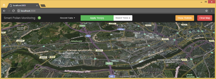
On the left, there is the Title of the Web application (Smart Pollen Map).
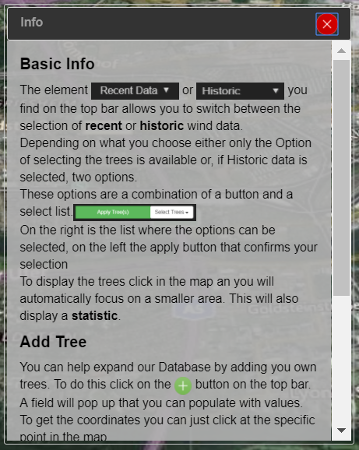
The Figure above describes the site’s general help function. It contains a short description of all the different functions that the application provides. It can be opened by clicking a blue (i) button on the top bar.
Right next to it there is a button with a plus symbol. This Button allows the User to add own Trees to our Tree Database, but further explanation on will be given later (Figure 17).

The next element in the Navigation bar is a select element. This allows the user to switch between the recent data and the historic Data. The standard selection is the recent data. This only shows the additional tree type selection.
If switched to historic data, there is also the possibility to select the historic Wind Data of a month that the users are interested in (Figure 18).

On the Right Border of the Navigation Bar there are two Buttons left. One has the purpose to clear the Map of the Tree selection, the other is to look at the statistic (Figure 19).

The Statistic is always calculated once users select a tree type. It shows how high is the potential of pollen flight per each month. It will automatically appear once users press the ‘Apply Tree(s)’ Button and disappear if clicked on the map, the statistic or on the close button. The close on click of the statistic itself has been added, since in some browsers not all the content will be shown, so the map and the (x) Button cannot be accessed. It will appear at the lower part of the screen and give users an easy overlook. Once it is closed, it can be reopened with a click on “Show Statistic” button. For Design purposes, the colors were kept in a similar look, most prominently featuring green and dark grey.

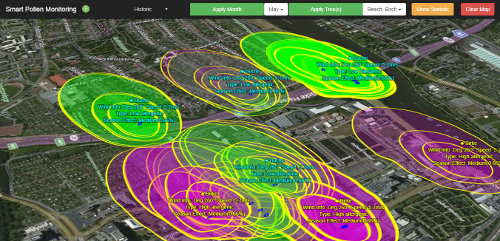
After users press on the “Apply Tree(s)” button and close the “Tree Statistic” window, the ellipse of the chosen tree will be generated and shown on the globe every time users click on the specific area of the globe which is limited by the bounding box, so it increases the application’s performance.
For example, the selection of trees: “beech and birch” in the historical data of month: “May” will provide the result shown in Figure 21.
One problem of the tree data is that it is not complete, as there are some trees missing in the database while they are there in real life. As a solution to this problem, a function is implemented that allows the user to add own trees to the underlying database. This will invite the user to actively participate and it gives the project a whole new dimension. This functionality is comparable to the ones of Open Street Map or Open Tree Data. It constantly improves itself by including the people, which is also an issue with smart city applications. The following reasons show why this idea can be adapted very well within this project:
The user has to deal with the simplest geographic data type, the point. There are basically only two coordinates necessary to describe this object. The user can obtain them very easily with a portable GPS receiver or even more easily, with a smartphone.
Another reason is that the underlying data model for a new tree is very simple. Additionally, to the coordinates, there are only the tree type, the crown diameter and the age necessary to define a new tree object. Since the crown diameter and the age don’t need a high accuracy anyway, the user can obtain this data by estimating it. For this purpose, it is necessary to rely on the thought, that only people that are interested in the types of trees that cause allergies use this application. Then, a basic knowledge of those trees will be given.
The coordinates can be entered manually into a form, which is invoked by clicking on the button with a plus symbol, next to the applications title.

In the recent version, the coordinates have to be geographic, that means in latitude-longitude format. This is not always easy to obtain; therefore, an easy function is added, that allows the user to fill the form directly by clicking onto the map in the application. The coordinates on the position where the user clicks are then entered into the form.

The other mandatory user inputs are:
The tree type can be selected out of predefined types, from a drop-down menu.

The diameter of the crown, a read only field. To input, add or subtract an increment by clicking on the up and down buttons next to the input field.

The age of the tree is set by typing in an integer value between 1 and 999.

By clicking on the light blue button in the title of the dialog, the user can get further information about how to use the Add Tree function. There is also a short description in form of a tooltip for each input element available. When the form is filled, the user can either abort the dialog and no tree will be added or he can submit the form. In the second case, the function validates the user input and when all values are correct, the data is send to the database.
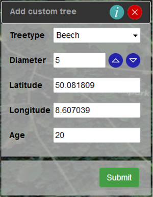
The dialog is created with the JQuery UI Class. It provides predefined dialog functions for different purposes. The predefined dialog is then customized by setting the necessary parameters when the dialog is invoked and by manipulating the DOM and the styling using JQuery.
The function for obtaining the coordinates at the cursor position by clicking on the map is self-constructed. The Web World Wind built-in event handler for click events, the “ClickRecognizer” is added to the WorldWindow object. The event invokes a function called “handleClick”. This function processes a parameter that is passed from the “ClickRecognizer” event, the “recognizer” object. With this object, the client-side coordinates, that means x and y on the canvas, at the cursor position are stored. This local Cartesian coordinates are transformed to geographic coordinates with the built-in function “pick” of the WorldWindow object. Finally, the geographic coordinates are passed to the related input fields of the Add Tree dialog via JQuery DOM manipulation.
The Web World Wind is fast, as soon as the globe is loaded., but there are a few negative points. One is the limited ability for visualization. There are not many possibilities for visualizing the pollen distribution., but maybe with more time and resources or with using the World Wind Java API instead, a better solution would be possible. Also, the documentation of the Web World only provides the most necessary information and it is also not good structured. Through the investigations it became clear that the Web World Wind is rarely used today. All online resources are outdated. Overall, it was hard to reach the goals of the project with the Web World Wind. This paper presents a solution, but it certainly can be done better with other APIs.
This solution is informative in a way that yet no related application is. In opposite to the common platforms for information about the current pollen stress, this application uses a higher grade of detail. This is because the application uses a base map that is highly scalable as it must show rural areas in detail. Another big difference is that it shows every single source of pollen and its spread in the direct neighborhood. This allows the user to find areas where he can avoid certain allergens within a city. Other solutions have the disadvantage that they only show a big area with one stage of pollen stress.
Despite the advantages of the application, there is still room for improvements. It can be considered to take more environmental influences into account. For example, if it was raining just recently, there is a lower pollen stress because it was washed out of the air. There can also be an additional subscriber model for participants. This means that the only people who are registered as participants with the project, can add custom trees. This is a way to overcome abuse of the function for adding trees.
Looking at all the research in biology this point of the application can be further improved through future findings. However, a first step of improving the application is to include other allergens. This can easily be done and has a great benefit. Also, over time the tree database will constantly grow and the more complete this database is, the higher is its benefit. Despite all the possible improvements, this application is ready to help people with allergies. It is also an important step towards an approach for visualizing pollen dispersal and other particular matter in a smart and interactive way.