Presentation of information, ideas and concepts demands interactivity and dynamic visualization. With the emergence of latest web standards, programming languages and server-side technology, the static presentations are no more appealing nowadays. The availability of open source and free libraries make it possible to effectively present works in cost effective way. The current project is a blend of modern web standards, data driven documents, database, web maps and server technology to visualize Sustainable Development Goal Indicators (SDGI).
The 2030 Agenda for Sustainable Development was launched two years ago and initially contained seventeen Sustainable Development Goals. The agenda is a shared plan that has the moto ‘to leave no one behind’ and it is deliberately ambitious and transformational, consisting of 17 integrated and indivisible goals. The agenda is not geographically restricted or bound to a specific country, but is rather an universal agenda, applying to all countries.
It is one of the main intention of the officials to collect and maintain data about the indicators across the globe on regular basis. For this, deployment of new technologies for more complete data collection and measurement is gaining attention of the authorities. It is assumed that in new upcoming years technologies will allow to update and refine the indicators regularly. However, the collection of data is one task, and effective presentation of data is another important step to convey the ideas. Therefore, to Implement new 2030 Agenda for Sustainable Development, a robust mechanism for follow up, review and update is required.
The Sustainable Development Solutions Network has formalized a SDG index and SDG dashboard that comprises of the indicators with significant country coverage. The visualization of these indicators is not only confined to static pie charts of bar graphs, but it requires interactivity so that a user may have a deep insight of data. While data is being visualized, it will be much more beneficial if we can enhance our visualization to be able to compute some statistics and perform analysis.
Data Driven Document (D3) is a pre-written JavaScript library which allows development of a number of applications as compare to using JavaScript alone. The D3 library is about 16000 lines long and 500 kilo bites of size. It was first released by Mike Bostock in 2011 and at the end of March 2017, the version 4.7.4 was released. D3 offers data visualization in several visualizations that are no longer limited to static charts as bar graphs, line charts and area charts. With D3, we are now able to add more interactivity to the standard visualization elements as we can build maps, network diagrams, histograms, scatter plots, donut charts or force directed simulations.
D3 was designed to fill up the pressing needs for web accessible and sophisticated data visualization. D3 is integrated into web standards and the Document Object Model (DOM) at the core of html. In this way, it provides developers with the ability to create rich interactive and animated contents based on the data and also bound those contents to the existing web page elements. Furthermore, we can create high performance data dashboards and sophisticated data visualization and hence we are able to update them dynamically.
The official website of United Nations holds a global database for sustainable development goal indicators in maintained the records of different indicators in the form of comma separated files (CSV). These records are directly viewed in web browsers and can be downloaded in CSV format. To use this data in D3 to generate dynamic web integrated contents, it’s important to store them in a database where basic operations lime retrieval can be performed, manipulation and updating of data. For this purpose, local server XAMPP is used to keep the dynamic flow of contents.
The prototype project is aimed to add additional functionality in the form of user interaction while presenting the information by using D3. Until now, the most updated information is available in CSV and MS Excel format to download. Even on the official website, there is no graphical representation of the information. The data is stored in global indicator database and queries can be performed to see a specific indicator or country related data. But the results are shown in tabular form and it’s difficult to get an overview at a glance.
On the other hand, D3 is emerging as a powerful tool of interactive data visualization with its version 4.7.7 released in 2017 and it’s still under continuous development. The use of D3 is gaining popularity and is added to front end applications to style, manipulate and make the data interactive.
The project is aimed to explore the use of Data Driven Document (D3), which is an open source JavaScript library, and web maps for interactive and dynamic visualization. The D3 is used to show how data can be used to derive the document for sophisticated visualization. The project is intended to visualize SDG Indicators using D3.js in a variety of visualization elements like animated choropleth world map, interactive bar graphs, pie charts and line graph etc.
The basic concept of the project is to present the information in styled, dynamic and interactive way to make it possible to extract the meaningful results from the data. The process starts with collections of data from a number of sources, mainly from the official SDGI website. The data is then processed in a way to make it a standardized form to be used further with D3. It is good to store data in a database, so that working with the idea would be easier. Once the data is ready to use, it is then processed in D3 to create visualization contents according to the data. Different visualizations are created depending upon the nature of data and its purpose. In order to make it more stylish, easy to manipulate and interactive with data, D3 focuses to bound the data with DOM.
The results of D3 are integrated to html webpage and for this a simply nice web page is design offering core functionalities of a modern webpage. Here we have easy to use user interface so that user may get the whole introduction about the project and visualize the data interactively. The setup is efficiently managed by using XAMPP free server and PHPMyAdmin for database creation and automatic table creation. Figure 1 shows a concise workflow of the basic idea of the whole project.
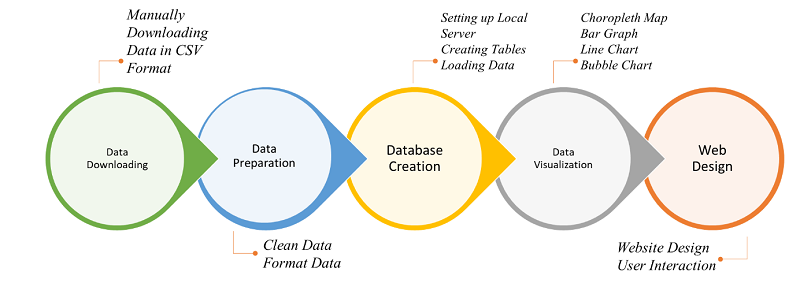
D3 not only deals with information visualization but also handles very specific geospatial data and network data. The project offers interactive dashboard and dynamically driven contents that can be integrated by any modern web browser. In order to retrieve and manipulate data, a database system is used. The final presentation offers additional web functionalities of a modern website.
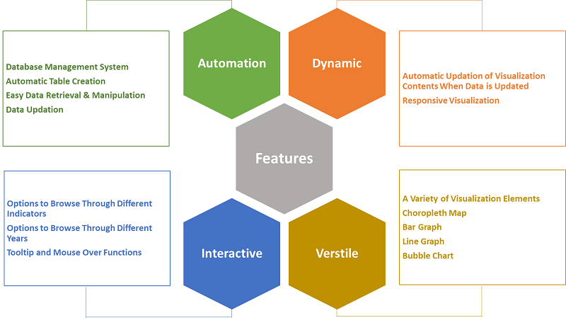
D3 is used to combine powerful visualization and interaction techniques with a data driven approach to DOM manipulation. As a result, we have full capabilities of a modern browsers and more convenient way to design the right interface for the data. Some of the key features are automation, dynamic, interactive and versatile nature of visualization elements.
During the whole course of project, the process is optimized to be automatic like creating tables in database and thus flow of data is dynamic. Updating and manipulation of data is easy to do and once data is updated, the respective presentation is also automatically changed accordingly.
The project offers interactivity, users have options to choose different indicators to visualize and also can see any indicator in different years. With the implementation of radio buttons and menu options, it offers great user interactivity. Depending on the nature and purpose of data, different visual elements are created to visualize so that the user can perceive the information more effectively.
The project runs on Ubuntu 16.04, another open source, good documented operating system. The data was downloaded from www.geofabrik.de in *.osm.pbf format ("Protocolbuffer Binary Format"), which is primarily intended as an alternative to the XML format. It is about half of the size of a gzipped planet and about 30% smaller than a bzipped planet. It is also about 5 times faster to write than a gzipped planet and 6 times faster to read than a gzipped planet. The format was designed to support future extensibility and flexibility.The data was imported in a Postgresql database, which is the base of the project.
The OSM tile server stack is a collection of programs and libraries that work together to create a tile server. As so often with OpenStreetMap, there are many ways to achieve this goal and nearly all of the components have alternatives that have various specific advantages and disadvantages. The project is based on the standard version that is also used on the main OpenStreetMap.org tile server. It consists of 5 main components: Mod_tile, renderd, mapnik, osm2pgsql and a postgresql/postgis database. Mod_tile is an apache module, that serves cached tiles and decides which tiles need re-rendering – either because they are not yet cached or because they are outdated. Renderd provides a priority queueing system for rendering requests to manage and smooth out the load from rendering requests. Mapnik is the software library that does the actual rendering and is used by renderd.
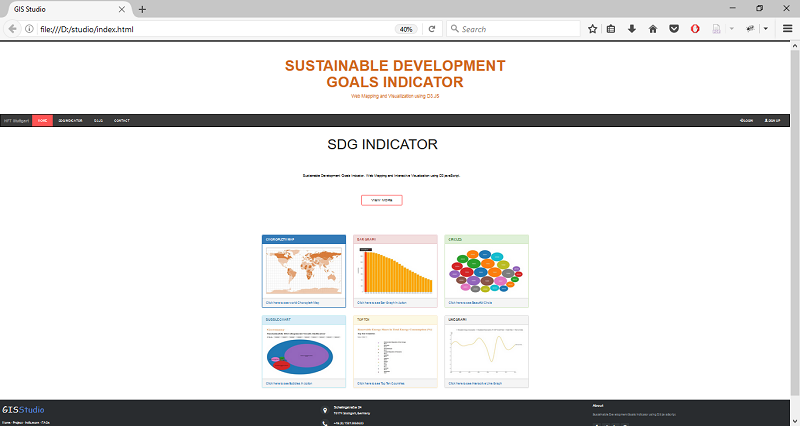
The main window as it appears at startup is shown in Figure 4 below. At the top, there is the title of the project that is followed by the menu bar. Here the user has different options and he can get more detailed information about HFT Stuttgart, the SGDI, D3.js and about the studio itself. On the right-hand side of the menu bar, there are options for the existing users to sign in and for the new users to sign up. In order to implement the visual hierarchy, a headline section is just below the menu bar displaying notifications about the project with transition effect.
In order to centralize the access to all the web page elements, a simple and nice dashboard is inserted there so that the user can see thumbnails of visualization elements and navigate to them to see the detailed view. Once a particular visualization is selected, it will open in a new window where the user has browsing options of selecting different indicators, years or countries. In this window, the user can use different interactive functions like tooltip and mouse over. In the bottom, there is a traditional footer containing contact information, social media links and also feedback options.
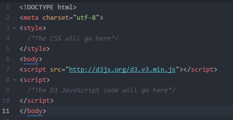
HTML stands for Hyper Text Markup Language and this is the language to design webpages. It is an .html file to hold the code and display the information that is accessible to the users via internet. This is the markup language for structuring and presenting contents on world wide web and the fifth version of the language is used for the project. The html boilerplate is shown in the following figure and here the CSS and JavaScript code are stored. Also, there are options to add additional html code to make the visualization more effective.
The cascading style sheet is a decorating and styling language used to describe the formatting of a document. The CSS makes the simplest presentation more elegant by assigning specific styles to specific objects. One of the important characteristic of CSS is that if one changes the CSS component, the whole presentation is changed. By using CSS, the overall look, feel and presentation of web contents is controlled and thus a number of properties can be set to the objects in the web page. The following figure shows the CSS rules for ‘body’, ‘header’, ‘header_bg’ and ‘logo’ with a selector and declaration with values. A CSS file can exist separately or can be included inside the html file.

SVG is an xml based vector image format for two-dimensional graphics that supports interactivity and animation. SVG is an open standard developed by World Wide Web Consortium (W3C) in 1999. The html5 has an integrated support for SVG. SVG serves as canvas to dray and hold the drawings. The SVG element can be styled using CSS to have different boarders and backgrounds and the element can be dynamically resized by using the view box attributes.
SVG is composed of fixed set of shapes and while scaling, the vector image preserves the shapes. Thus, the image quality is not distorted while using zoom in function. Another important property of SVG is that it has capacity to support both text and shapes. By default, a drawing in SVG starts at 0,0 from the upper left corner that can be translated to move it to the desired position. In order to move all the elements together, we use a
Document Object Model (DOM) is a cross platform and language independent application programming interface that applies a tree structure to html, xhtml or xml document. DOM consists of nodes, parents, children where every node is an object that represents the part of the document.
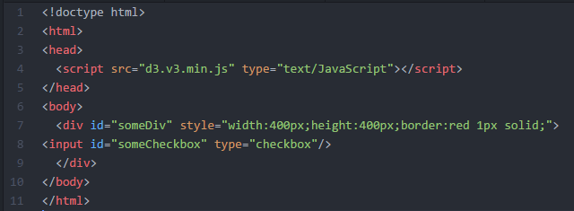
In the following figure, the line 4 and 6 are the child elements of <html>. The line 7 is a child element of <body> and line 8 is a child element of <div>. This is the basic DOM structure that html follows.
Bootstrap is applied in the project as it provides a number of nice capabilities for fine tuning layout and styling. It is free to download and most popular html, CSS and JavaScript framework for developing responsive and mobile-first web sites. But, bootstrap depends on jQuery and one needs to load it as well; it should be loaded before the bootstrap in html page.
Comma Separated Values (CSV) files store tabular data, both number and texts in plain text format where each line of the file represents the record. The comma is used to separate fields and that is why the file is called comma separated. Sometimes the format is not of good use because the fields are separated by the comma but the problem arises when using the comma in the data as to core data itself, for example quotation marks.
In this project, the data is available to download in CSV format and each file consists of a number of columns. This data is processed and standardized before actually going to be used for the presentation. Some unwanted columns are removed and column names are refined. Furthermore, the international country code is a critical element to be used in data processing. Therefore, the international country code is automatically integrated in each table present in the database.
The most important data type used is JavaScript Object Notation (JSON), which is an open standard file format and applies human readable text to transmit objects. This is lightweight data change format and easy for human to read and write and for machines to parse and generate it. The objects contain value pairs and array data types. JSON files are created dynamically based on SQL queries by retrieving data from the database. This operation is performed while the user is selecting options such as visualization type, indicator name, country name etc.
The project mainly focusses on the two above described data formats but D3 is not limited to these formats only. Other data formats which can be used and visualized are tabular data, network data, geographic data, raw data and objects. It’s always important to standardize the format of data to run the process smoothly and also to easily update the date later as necessary.
JavaScript is a scripting language and contains the main code. Mainly it is a front-end language, being used for interaction with data and the D3 library is also JavaScript based. D3, like many other data visualization libraries in JavaScript, provides functions to facilitate the process of creating and modifying web page elements. The top most advantage is that it provides mechanism to link data to the web page elements in such a way that it makes the drawing and updating of SVG elements reusable and maintainable.
The web application written in D3 JavaScript, can fulfill most of the user interface functionality that users can expect without using jQuery.
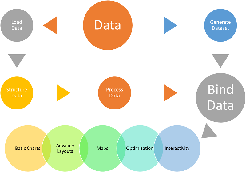
The following figure summarizes the approach of D3 used for visualization of Data. The process starts with the data, and once one has the data he can directly load it in order to format it in a standard form. The data is then processed before actually binding it with visualization elements. The other option is to directly generate a dataset. Both datasets, processed and generated will be bound to visualization elements.
D3 uses the data to create visualization elements depending on the type and nature of data. For example, D3 can produce basic charts like bar charts, line graphs, pie charts and bubble charts, web maps and interactive globes, interactive network visualizations and also offers numerous SVG drawing functions to make it possible to create custom visualizations. Finally, all these layouts and functions can be combined to create a data dashboard.
Although D3 has a strong ability to create rich and varied visualization graphics, but even more important is to integrate high level of interactivity to the visualization process. And luckily, D3 includes a wide range of interactive components and behaviors that are standard in data visualization and web development. Moreover, D3 gives power to create custom visualizations that is generally not found in a general library. The library of D3 has a wide coverage, even it has power to treat images and text as data. The core concept of D3 is selecting the data and binding it to visualization element to derive your document on the base of data.
PHP is a server-side scripting language designed primarily for web development but also used as a general-purpose programming language. PHP code may be embedded into HTML, or it can be used in combination with various web template systems, web content management systems and web frameworks. Although the influence of PHP on this project cannot be seen, it’s playing a great role. In this project, PHP is involved in several parts of the website. Firstly, it was the mean for the database’s and tables’ creation. Secondly, reading and uploading CSV files into the tables. Furthermore, retrieving data from the database while the user-website interaction takes place. PHP was executed remotely on server, thus it’s not part of the webpage, but it forms the webpage.
The concept of this project is based on a client-server application. For the server side, we opted to use XAMPP as a web server because it’s a free and open source cross-platform web server solution stack package consisting mainly of the Apache HTTP Server and interpreters for scripts written in the PHP programming languages. Another reason for why XAMPP was chosen is that it is a simple, lightweight Apache distribution that makes it extremely easy for creating a local web server.
As mentioned before, the available data format is CSV, which was not suitable to be used in such kind of project. For a better performance, a database was used. Once the CSV files are downloaded, they are put in a specific folder which contains only CSV files. Then, exploring that folder using PHP, the database is created and filled based on those files. This operation is executed repeatedly each time the index page is loaded in order to update the database in case new CSV files have been introduced.
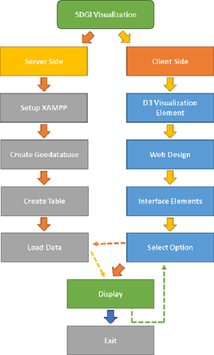
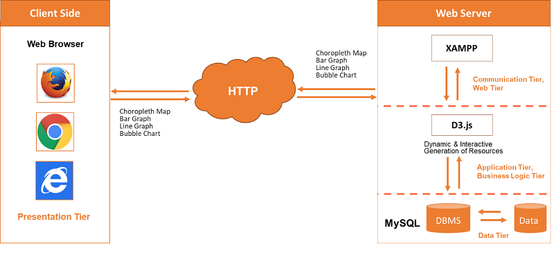
The overall workflow for the whole project is shown in Figure 9. The project can be divided into mainly two parts: the client side and the server side. The server side is setup with a series of steps and the very first is the installation of XAMPP free server. Once the server is installed, the next step is the creation of geodatabase so that data can be efficiently managed, stored and manipulated. After creating the geodatabase, tables are created automatically and they are populated with the data downloaded from the official website of SDGI in csv format. Now the data is ready for presentation and can be directly displayed.
On the other hand, parallel to this is the client side that is simple but multifunction graphic user interface of website. The client-side setup starts with the creation of visualization elements in D3 and then these elements are embedded to html webpage. The website design contains all the latest components of user interface and has also a dashboard so that the user may have an idea of the available visualization elements. Once the user clicks on any visualization element, it opens to a new page and offers him several options including selection of indicators and different years etc. On the selection of different options, the data is displayed accordingly then the user may switch back to the home page and can select another visualization element with the desired indicator and year.
A number of technologies are deployed to make the visualization dynamic and interactive. First of all, in order to make the flow data dynamic, a geodatabase is created using PHPMyAdmin. This is because the data is available in CSV format and to manipulate data in this format is not as easy as in the case of geodatabases. In the geodatabase, the creation of tables is done automatically as populating these tables is automatically. Another advantage of the database is that if the original data is changed, records can easily be updated in the database. In this way, the dynamic flow of data and visualization will be updated accordingly each time when updating the data in the database.
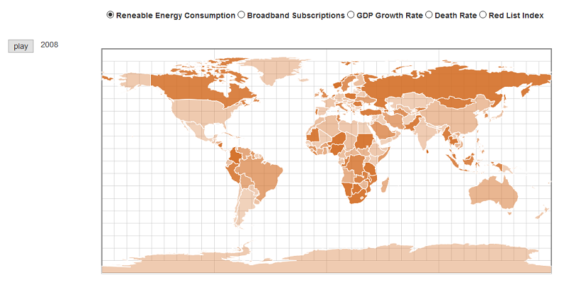
Another core technology used in the project is the use of D3 JavaScript library. By using this library, the maps are no more static as the mouse stays over functions and the user can interact with the data in a number of ways. As it is represented in Figure 12, a choropleth map shows the data of more than one year. Moreover, the user can select through the number of available indicators and the display will be changed according to each indicator.
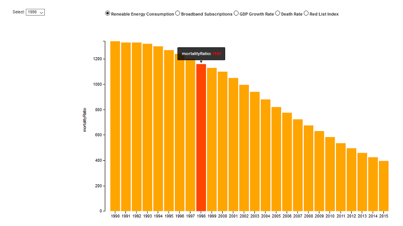
Figure 13 illustrates another example of user interaction in which the user has the option to browse through the years and can also select a different indicator. When the user’s mouse is over the bars, here D3 plays its role and each bar displays its respective additional information. The same functionality is true for some visualization elements like bubble charts and line graphs.
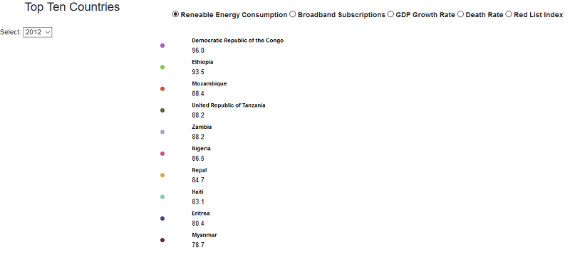
From the analyzer’s point of view, the project deployed D3 to sort out top ten countries as shown in Figure 14. This is a very important visualization element from the analysis point of view; as the users only need to select a year and a particular factor, the result will be a list of top ten countries for a particular indicator in the selected year.
As for the design of the website is concerned, it is a responsive design and enriched with modern user interface elements that provide all the functionalities of menu, navigation, submission form, dashboard for going through the different visualization elements.
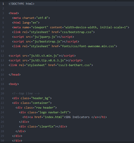
Every visualization element is coded using D3 JavaScript library and for the current elements version 3 of D3 is used. The basic structure of code for all the elements is somehow following the same pattern as shown below in Figure 15. It is worth to mention that all the codes of D3 are held into an html document, so the basic coding starts with the very basic structure of html. At line 6 of the snippet, is the code to make the webpage responsive. In the following lines, there is the reference for the bootstrap styling sheet, jQuery styles for font, D3 version 3, D3 tooltip reference and style sheet for the visualization element itself. All these references are coded into the head section of html. In the snippet of the code, next to the head is the body section that holds the main code including header, footer and core code of D3. It can be noticed that the are different div elements to different sections in the html page.
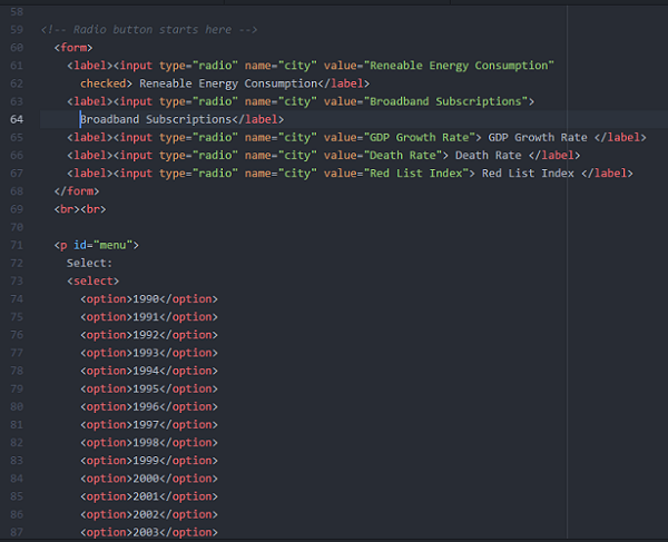
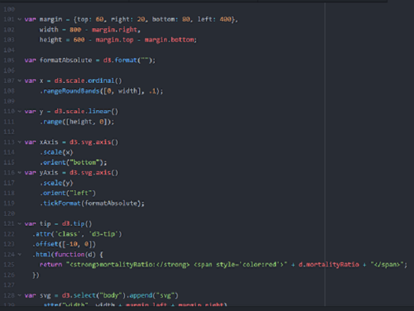
In Figure 16, there is code for the form containing radio button so that the user can select different options from different indicators. A menu section can also be to select different indicators from different years. In Figure 17, the coding for D3 starts and first the canvas is defined to hold the SVG element created by D3. In the line 101 to 103, the canvas width, height and its position in the html page is defined. As these are snippets of the bar graph, in the next lines the scale is defined for x-axis and y-axis and also their position and orientation of axis labels. From line 121, the tooltip is added so that when moving over the bars the color is changed to red and the value of the indicator is shown along with its name. In the line 128, the SVG element is embedded to the body of the html page, so that it can hold the resultant bars.
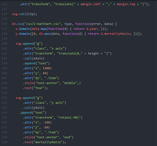
In line 140 of Figure 18, a group element ‘g’ is present to group SVG shapes together and if the transform is applied, all the shapes are transformed together as they are a single group. There are two group elements to hold the x-axis and y-axis elements together. The code further contains the code lines for the placement of both axis.In line 140 of Figure 18, a group element ‘g’ is present to group SVG shapes together and if the transform is applied, all the shapes are transformed together as they are a single group. There are two group elements to hold the x-axis and y-axis elements together. The code further contains the code lines for the placement of both axis.
For different types of visualization, the user has the opportunity to change the options such as the indicator, the country and/or a specific year. Behind that, an SQL query is sent to the server side where the required data should be retrieved and converted to a JSON file format, assigned to the adequate template and finally sent back to the user to visualize it. All these operations can be done in the blink of an eye, due to the speed of the database access and the lightness of JSON files. The architectural diagram for the project is shown in Figure 19 below.
This project can be extended by: